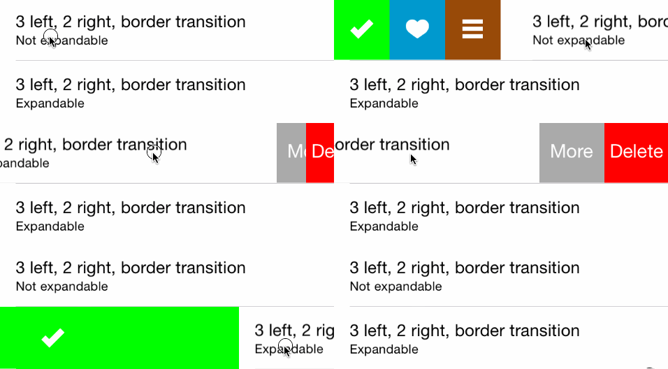
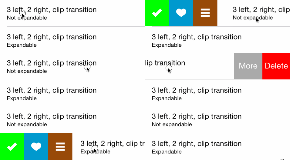
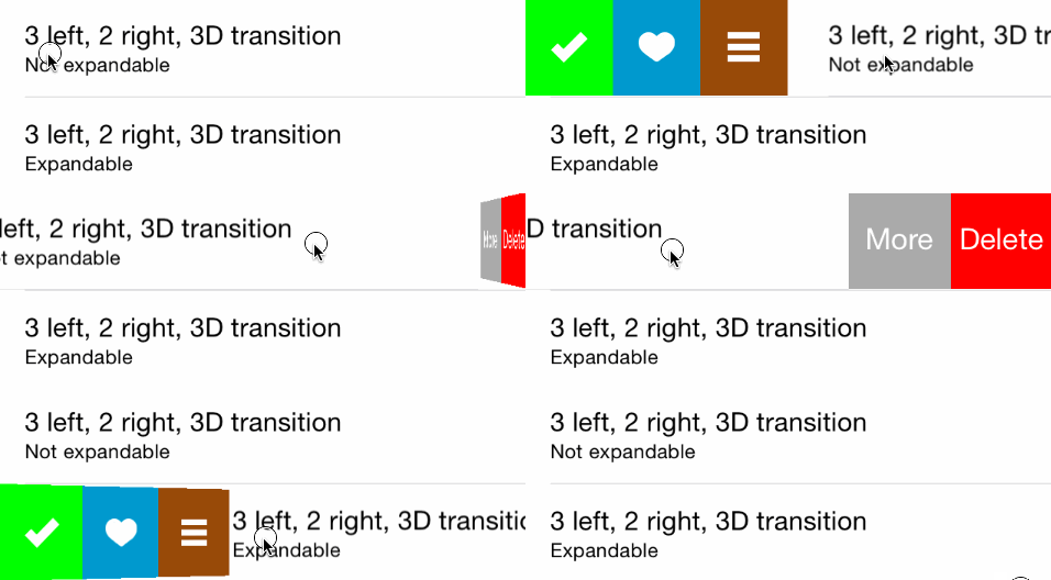
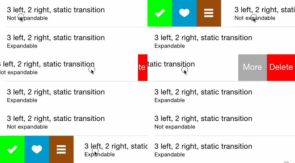
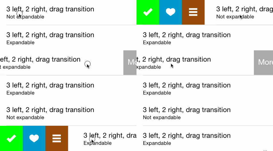
MGSwipeTableCell is an easy to use UITableViewCell subclass that allows to display swipeable buttons with a variety of transitions.
This library is compatible with all the different ways to create a UITableViewCell: system predefined styles, programmatically created cells, cells loaded from a xib and prototype cells within a storyboard. You can use autolayout if you want.
Works on iOS >= 5.0. Tested on all iOS versions on iPhone and iPad: iOS 7, iOS 8, iOS 9, iOS 10, iOS 11, iOS 12, iOS 13, iOS 14.
See MGSwipeTableCell.h header file for a complete overview of the capabilities of the class.
See MailAppDemo for a complete project which mimics Apple's Mail App (written in Objective-C)
See MailAppDemoSwift for a complete project which mimics Apple's Mail App (Written in Swift)
See SpotifyDemo for a complete project which mimics Spotify App swipe style
See MGSwipeDemo for a complete project where you can test the variety of transitions on a real device/simulator.
You can use CocoaPods to include MGSwipeTableCell into you project:
pod 'MGSwipeTableCell'
You can use Carthage to include MGSwipeTableCell into your project. Just add this dependency to your Cartfile:
github "MortimerGoro/MGSwipeTableCell"
You can use Swift Package Manager to include MGSwipeTableCell into you project:
.package(url: "https://github.com/MortimerGoro/MGSwipeTableCell.git", from: "1.6.0")
Integrating MGSwipeTableCell in your project is very easy. Basically, you only have to inherit from MGSwipeTableCell instead of UITableViewCell, or directly instantiate MGSwipeTableCell instances with iOS predefined cell styles. You can layout your cell content as you are used to do, MGSwipeTableCell doesn't force you to change layouts.
Here is a example of a MGSwipeTableCell using iOS predefined styles. You can set an array of buttons to cell.leftButtons and/or cell.rightButtons properties. MGSwipeButton is a convenience class, you are not forced to use it. You can use your own UIButtons or UIViews. You can configure transitions (and swipe thresholds) with the leftSwipeSettings and/or rightSwipeSettings properties
- (UITableViewCell *)tableView:(UITableView *)tableView cellForRowAtIndexPath:(NSIndexPath *)indexPath
{
    static NSString * reuseIdentifier = @"programmaticCell";
    MGSwipeTableCell * cell = [self.tableView dequeueReusableCellWithIdentifier:reuseIdentifier];
    if (!cell) {
        cell = [[MGSwipeTableCell alloc] initWithStyle:UITableViewCellStyleSubtitle reuseIdentifier:reuseIdentifier];
    }

    cell.textLabel.text = @"Title";
    cell.detailTextLabel.text = @"Detail text";
    cell.delegate = self; //optional


    //configure left buttons
    cell.leftButtons = @[[MGSwipeButton buttonWithTitle:@"" icon:[UIImage imageNamed:@"check.png"] backgroundColor:[UIColor greenColor]],
                          [MGSwipeButton buttonWithTitle:@"" icon:[UIImage imageNamed:@"fav.png"] backgroundColor:[UIColor blueColor]]];
    cell.leftSwipeSettings.transition = MGSwipeTransition3D;

    //configure right buttons
    cell.rightButtons = @[[MGSwipeButton buttonWithTitle:@"Delete" backgroundColor:[UIColor redColor]],
                           [MGSwipeButton buttonWithTitle:@"More" backgroundColor:[UIColor lightGrayColor]]];
    cell.rightSwipeSettings.transition = MGSwipeTransition3D;
    return cell;
}func tableView(_ tableView: UITableView, cellForRowAt indexPath: IndexPath) -> UITableViewCell
{
let reuseIdentifier = "programmaticCell"
var cell = tableView.dequeueReusableCell(withIdentifier: reuseIdentifier, for: indexPath) as! MGSwipeTableCell
cell.textLabel!.text = "Title"
cell.detailTextLabel!.text = "Detail text"
cell.delegate = self //optional
//configure left buttons
cell.leftButtons = [MGSwipeButton(title: "", icon: UIImage(named:"check.png"), backgroundColor: .green),
MGSwipeButton(title: "", icon: UIImage(named:"fav.png"), backgroundColor: .blue)]
cell.leftSwipeSettings.transition = .rotate3D
//configure right buttons
cell.rightButtons = [MGSwipeButton(title: "Delete", backgroundColor: .red),
MGSwipeButton(title: "More",backgroundColor: .lightGray)]
cell.rightSwipeSettings.transition = .rotate3D
return cell
}In order to listen for button click events you can implement the optional MGSwipeTableCellDelegate, or if you are too lazy to do that, the MGSwipeButton class comes with a convenience block callback ;)
[MGSwipeButton buttonWithTitle:@"More" backgroundColor:[UIColor lightGrayColor] callback:^BOOL(MGSwipeTableCell *sender) {
      NSLog(@"Convenience callback for swipe buttons!");
}]MGSwipeButton(title: "Delete", backgroundColor: .red) {
(sender: MGSwipeTableCell!) -> Bool in
print("Convenience callback for swipe buttons!")
return true
}MGSwipeTableCellDelegate is an optional delegate to configure swipe buttons or to receive triggered actions or another events. Buttons can be configured inline when the cell is created instead of using this delegate, but using the delegate improves memory usage since buttons are only created on demand.
@protocol MGSwipeTableCellDelegate <NSObject>

@optional
/**
 * Delegate method to enable/disable swipe gestures
 * @return YES if swipe is allowed
 **/
-(BOOL) swipeTableCell:(MGSwipeTableCell*) cell canSwipe:(MGSwipeDirection) direction;
/**
 * Delegate method invoked when the current swipe state changes
 @param state the current Swipe State
 @param gestureIsActive YES if the user swipe gesture is active. No if the uses has already ended the gesture
 **/
-(void) swipeTableCell:(MGSwipeTableCell*) cell didChangeSwipeState:(MGSwipeState) state gestureIsActive:(BOOL) gestureIsActive;
/**
 * Called when the user clicks a swipe button or when a expandable button is automatically triggered
 * @return YES to autohide the current swipe buttons
 **/
-(BOOL) swipeTableCell:(MGSwipeTableCell*) cell tappedButtonAtIndex:(NSInteger) index direction:(MGSwipeDirection)direction fromExpansion:(BOOL) fromExpansion;
/**
 * Delegate method to setup the swipe buttons and swipe/expansion settings
 * Buttons can be any kind of UIView but it's recommended to use the convenience MGSwipeButton class
 * Setting up buttons with this delegate instead of using cell properties improves memory usage because buttons are only created in demand
 * @param swipeTableCell the UITableViewCell to configure. You can get the indexPath using [tableView indexPathForCell:cell]
 * @param direction The swipe direction (left to right or right to left)
 * @param swipeSettings instance to configure the swipe transition and setting (optional)
 * @param expansionSettings instance to configure button expansions (optional)
 * @return Buttons array
 **/
-(NSArray*) swipeTableCell:(MGSwipeTableCell*) cell swipeButtonsForDirection:(MGSwipeDirection)direction
             swipeSettings:(MGSwipeSettings*) swipeSettings expansionSettings:(MGSwipeExpansionSettings*) expansionSettings;

@endButtons are not expandable by default. You can set up expandable buttons using cell.leftExpansion and cell.rightExpansion properties
Expandable button events are triggered automatically when the user ends the swipe gesture and the expansion is active (configurable via threshold value). Triggered expandable buttons can bounce back to their initial position or fill the entire UITableViewCell, you can select the desired animation using fillOnTrigger property.
@interface MGSwipeExpansionSettings: NSObject
/** index of the expandable button (in the left or right buttons arrays) */
@property (nonatomic, assign) NSInteger buttonIndex;
/** if true the button fills the cell on trigger, else it bounces back to its initial position */
@property (nonatomic, assign) BOOL fillOnTrigger;
/** Size proportional threshold to trigger the expansion button. Default value 1.5 */
@property (nonatomic, assign) CGFloat threshold;
@endMGSwipeTableCell supports rounded corners. Example:
cell.layer.cornerRadius = 50
cell.backgroundColor = UIColor.gray
cell.clipsToBounds = true
cell.swipeBackgroundColor = UIColor.grayThe MIT License (MIT)
Copyright (c) 2014 Imanol Fernandez @MortimerGoro
Permission is hereby granted, free of charge, to any person obtaining a copy of this software and associated documentation files (the "Software"), to deal in the Software without restriction, including without limitation the rights to use, copy, modify, merge, publish, distribute, sublicense, and/or sell copies of the Software, and to permit persons to whom the Software is furnished to do so, subject to the following conditions:
The above copyright notice and this permission notice shall be included in all copies or substantial portions of the Software.
THE SOFTWARE IS PROVIDED "AS IS", WITHOUT WARRANTY OF ANY KIND, EXPRESS OR IMPLIED, INCLUDING BUT NOT LIMITED TO THE WARRANTIES OF MERCHANTABILITY, FITNESS FOR A PARTICULAR PURPOSE AND NONINFRINGEMENT. IN NO EVENT SHALL THE AUTHORS OR COPYRIGHT HOLDERS BE LIABLE FOR ANY CLAIM, DAMAGES OR OTHER LIABILITY, WHETHER IN AN ACTION OF CONTRACT, TORT OR OTHERWISE, ARISING FROM, OUT OF OR IN CONNECTION WITH THE SOFTWARE OR THE USE OR OTHER DEALINGS IN THE SOFTWARE.

