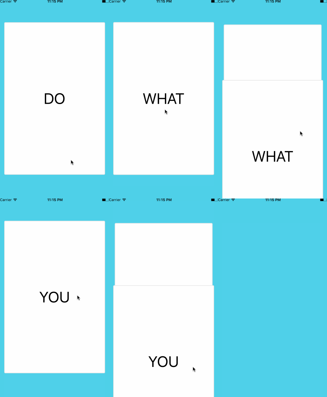
npm install react-native-deck-swiper --save
- Rotation animation
- Opacity animation
- Zoom animation
- Overlay labels
- Show next card while swiping
- Swipe event callbacks
- Trigger swipe animations programmatically
- Jump to a card index
- Swipe to previous card
- Underlaying cards offset
- Never-ending, animated deck when infinite property is true
- Swipe back to previous card with a custom animation
| Props | type | description | required | default |
|---|---|---|---|---|
| cards | array | array of data for the cards to be rendered | required | |
| renderCard | func(cardData, cardIndex) | function to render the card based on the data | required | |
| keyExtractor | func(cardData) | function to get the card's react key | null | |
| cardIndex | number | cardIndex to start with | 0 | |
| infinite | bool | keep swiping indefinitely | false | |
| horizontalSwipe | bool | enable/disable horizontal swiping | true | |
| verticalSwipe | bool | enable/disable vertical swiping | true | |
| showSecondCard | bool | enable/disable second card while swiping | true | |
| stackSize | number | number of underlaying cards to show (showSecondCard must be enabled) | 0 |
| Props | type | description | default |
|---|---|---|---|
| onSwipedAll | func | function to be called when all cards have been swiped | |
| onSwiped | func | function to be called when a card is swiped. it receives the swiped card index | |
| onSwipedAborted | func | function to be called when a card is released before reaching the threshold | |
| onSwipedLeft | func | function to be called when a card is swiped left. it receives the swiped card index | |
| onSwipedRight | func | function to be called when a card is swiped right. it receives the swiped card index | |
| onSwipedTop | func | function to be called when a card is swiped top. it receives the swiped card index | |
| onSwipedBottom | func | function to be called when a card is swiped bottom. it receives the swiped card index | |
| onSwiping | func | function to be called when a card is being moved. it receives X and Y positions | |
| dragStart | func | function to be called when drag start | |
| dragEnd | func | function to be called when drag end | |
| onTapCard | func | function to be called when tapping a card. it receives the tapped card index | |
| onTapCardDeadZone | number | maximum amount of movement before a tap is no longer recognized as a tap | 5 |
| Props | type | description | default |
|---|---|---|---|
| verticalThreshold | number | vertical swipe threshold | height / 5 |
| horizontalThreshold | number | horizontal swipe threshold | width / 4 |
| swipeAnimationDuration | number | duration of the swipe animation | 350 |
| disableBottomSwipe | bool | disable bottom swipe | false |
| disableLeftSwipe | bool | disable left swipe | false |
| disableRightSwipe | bool | disable right swipe | false |
| disableTopSwipe | bool | disable top swipe | false |
| Props | type | description | default |
|---|---|---|---|
| stackSeparation | number | vertical separation between underlaying cards | 10 |
| stackScale | number | percentage to reduce the size of each underlaying card | 3 |
| stackAnimationFriction | number | spring animation friction (bounciness) | 7 |
| stackAnimationTension | number | spring animation tension (speed) | 40 |
| Props | type | description | default |
|---|---|---|---|
| inputRotationRange | array | x values range for the rotation output | [-width / 2, 0, width / 2] |
| outputRotationRange | array | rotation values for the x values in inputRotationRange | ["-10deg", "0deg", "10deg"] |
| Props | type | description | default |
|---|---|---|---|
| animateCardOpacity | bool | animate card opacity | false |
| inputCardOpacityRangeX | array | pan x card opacity input range | [-width / 2, -width / 3, 0, width / 3, width / 2] |
| outputCardOpacityRangeX | array | opacity values for the values in inputCardOpacityRangeX | [0.8, 1, 1, 1, 0.8] |
| inputCardOpacityRangeY | array | pan y card opacity input range | [-height / 2, -height / 3, 0, height / 3, height / 2] |
| outputCardOpacityRangeY | array | opacity values for the values in inputCardOpacityRangeY | [0.8, 1, 1, 1, 0.8] |
| animateOverlayLabelsOpacity | bool | animate card overlay labels opacity | false |
| inputOverlayLabelsOpacityRangeX | array | pan x overlay labels opacity input range | [-width / 3, -width / 4, 0, width / 4, width / 3] |
| outputOverlayLabelsOpacityRangeX | array | opacity values for the values in inputOverlayLabelsOpacityRangeX | [1, 0, 0, 0, 1] |
| inputOverlayLabelsOpacityRangeY | array | pan x overlay labels opacity input range | [-height / 4, -height / 5, 0, height / 5, height / 4] |
| outputOverlayLabelsOpacityRangeY | array | opacity values for the values in inputOverlayLabelsOpacityRangeY | [1, 0, 0, 0, 1] |
| overlayOpacityVerticalThreshold | number | vertical threshold for overlay label | height / 5 |
| overlayOpacityHorizontalThreshold | number | horizontal threshold for overlay label | width / 4 |
2 steps of inputOverlayLabelsOpacityRangeX and inputOverlayLabelsOpacityRangeY should match horizontalThreshold and verticalThreshold, respectively.
| Props | type | description | default |
|---|---|---|---|
| overlayLabels | object | swipe labels title and style | null, see below for format |
| overlayLabelStyle | object | swipe labels style | null, see below for format |
| overlayLabelWrapperStyle | object | overlay label wrapper style | see below for default |
{
  fontSize: 45,
  fontWeight: 'bold',
  borderRadius: 10,
  padding: 10,
  overflow: 'hidden'
}{
position: 'absolute',
backgroundColor: 'transparent',
zIndex: 2,
flex: 1,
width: '100%',
height: '100%'
}{
bottom: {
element: <Text>BLEAH</Text> /* Optional */
title: 'BLEAH',
style: {
label: {
backgroundColor: 'black',
borderColor: 'black',
color: 'white',
borderWidth: 1
},
wrapper: {
flexDirection: 'column',
alignItems: 'center',
justifyContent: 'center'
}
}
},
left: {
element: <Text>NOPE</Text> /* Optional */
title: 'NOPE',
style: {
label: {
backgroundColor: 'black',
borderColor: 'black',
color: 'white',
borderWidth: 1
},
wrapper: {
flexDirection: 'column',
alignItems: 'flex-end',
justifyContent: 'flex-start',
marginTop: 30,
marginLeft: -30
}
}
},
right: {
element: <Text>LIKE</Text> /* Optional */
title: 'LIKE',
style: {
label: {
backgroundColor: 'black',
borderColor: 'black',
color: 'white',
borderWidth: 1
},
wrapper: {
flexDirection: 'column',
alignItems: 'flex-start',
justifyContent: 'flex-start',
marginTop: 30,
marginLeft: 30
}
}
},
top: {
element: <Text>SUPER</Text> /* Optional */
title: 'SUPER LIKE',
style: {
label: {
backgroundColor: 'black',
borderColor: 'black',
color: 'white',
borderWidth: 1
},
wrapper: {
flexDirection: 'column',
alignItems: 'center',
justifyContent: 'center'
}
}
}
}Make sure you set showSecondCard={false} for smoother and proper transitions while going back to previous card.
| Props | type | description | default |
|---|---|---|---|
| goBackToPreviousCardOnSwipeLeft | bool | previous card is rendered on left swipe | false |
| goBackToPreviousCardOnSwipeRight | bool | previous card is rendered on right swipe | false |
| goBackToPreviousCardOnSwipeTop | bool | previous card is rendered on top swipe | false |
| goBackToPreviousCardOnSwipeBottom | bool | previous card is rendered on bottom swipe | false |
| Props | type | description | default |
|---|---|---|---|
| backgroundColor | string | background color for the view containing the cards | '#4FD0E9' |
| marginTop | number | marginTop for the swiper container | 0 |
| marginBottom | number | marginBottom for the swiper container | 0 |
| cardVerticalMargin | number | card vertical margin | 60 |
| cardHorizontalMargin | number | card horizontal margin | 20 |
| childrenOnTop | bool | render children on top or not | false |
| cardStyle | node | override swipable card style | {} |
| containerStyle | node | overrides for the containing style | {} |
| pointerEvents | string | pointerEvents prop for the containing | 'auto' |
| useViewOverflow | bool | use ViewOverflow instead of View for the Swiper component | true |
| Name | type | description |
|---|---|---|
| swipeBack | callback | swipe back into deck last swiped card |
| Props | type | description | default |
|---|---|---|---|
| previousCardDefaultPositionX | number | Animation start position oX when card swipes back into deck | -width |
| previousCardDefaultPositionY | number | Animation start position oY when card swipes back into deck | -height |
| stackAnimationFriction | number | spring animation friction (bounciness) | 7 |
| stackAnimationTension | number | spring animation tension (speed) | 40 |
| stackAnimationTension | number | spring animation tension (speed) | 40 |
| swipeBackCard | bool | renders swipe back card, in order to animate it | false |
To trigger imperative animations, you can use a reference to the Swiper component.
| Name | arguments | description |
|---|---|---|
| swipeLeft | mustDecrementCardIndex = false | swipe left to the next card |
| swipeRight | mustDecrementCardIndex = false | swipe right to the next card |
| swipeTop | mustDecrementCardIndex = false | swipe top to the next card |
| swipeBottom | mustDecrementCardIndex = false | swipe bottom to the next card |
| jumpToCardIndex | cardIndex | set the current card index |
render () {
    <View style={styles.container}>
        <Swiper
            cards={['DO', 'MORE', 'OF', 'WHAT', 'MAKES', 'YOU', 'HAPPY']}
            renderCard={(card) => {
                return (
                    <View style={styles.card}>
                        <Text style={styles.text}>{card}</Text>
                    </View>
                )
            }}
            onSwiped={(cardIndex) => {console.log(cardIndex)}}
            onSwipedAll={() => {console.log('onSwipedAll')}}
            cardIndex={0}
            backgroundColor={'#4FD0E9'}
            stackSize= {3}>
            <Button
                onPress={() => {console.log('oulala')}}
                title="Press me">
                You can press me
            </Button>
        </Swiper>
    </View>
}
Demo inside the Example Folder
const styles = StyleSheet.create({
  container: {
    flex: 1,
    backgroundColor: "#F5FCFF"
  },
  card: {
    flex: 1,
    borderRadius: 4,
    borderWidth: 2,
    borderColor: "#E8E8E8",
    justifyContent: "center",
    backgroundColor: "white"
  },
  text: {
    textAlign: "center",
    fontSize: 50,
    backgroundColor: "transparent"
  }
});Card properties may change, including on already swiped cards, which would yield no effects to users as the cards would no longer be displayed [based on initial issue].
A possible fix for the situation is setting the cardIndex on the parent component whenever deck re-renders are needed.
const { cardIndex } = this.props;
return (<Swiper
  ref={swiper => {
    this.swiper = swiper;
  }}
  {...customSwiperProps}
  cardIndex={cardIndex}
/>)
Passing along the cardIndex to the swiper will allow external changes on the property, thus triggering a re-render of the deck of cards. All onSwipe callbacks return the cardIndex that can be used to push the updated cardIndex to app state (redux or something else).
By making sure that external changes on the cardIndex match those the swiper performs (increment on swipes, decrement on swipeBack) one can ensure no re-renders occur when not needed.
If you've encountered issues while running the example app located in the Example folder, try the following steps:
If you're using yarn
- rm -rf node_modules && rm yarn.lock
- yarn cache clean
- yarn
- react-native run-ios
- react-native run-android
If you're using npm
- rm -rf node_modules && rm package-lock.json
- npm cache clean --force
- npm install
- react-native run-ios
- react-native run-android
If bundler doesn't automatically start Simply run yarn start or npm start in the Example folder.
Don't forget to bump project and example versions in package.json whenever you submit a PR.


